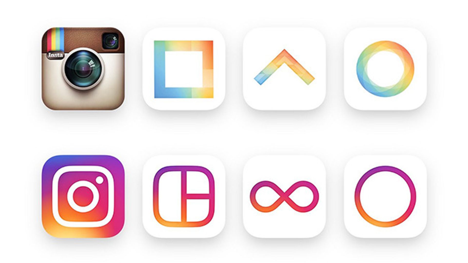
If you're one of those people who doesn't like change, you'll probably want to avoid Instagram for a while. The picture sharing app has unveiled a new look – and it's been met with very mixed reviews.There's no denying Instagram needed a bit of a refresh: since its launch in 2010 we've had the same retro camera logo and timely updates have eased us into any major techy changes to the app we've come to depend on in the last five years.
 Photo: © Instagram
Instagram debuted a new look this week
But this week everything changed. Gone was the old camera logo and in its place an explosion of colour which has divided the internet. The new design features a background in vibrant sunset hues with a white outline of a camera over the top.
A pretty simple change, right? But the bosses over at Instagram didn't stop there. It's got a new black-and-white typeface, and notifications have changed from orange to red. And it's not just Instagram that's different: companion apps Boomerang, Layout and Hyperlapse all got sunset rainbow makeovers.
 Photo: © Instagram
Boomerang, Layout and Hyperlapse have also changed
And although some users have complained about the update, many have embraced the change and insist the app was in need of a new look.In an official blog post, Instagram explained: "[The] community has evolved over the past five years from a place that shared filtered photos to so much more – a global community of interests sharing more than 80m photos and videos every day. Our updated look reflects how vibrant and diverse your storytelling has become. "Instagram was created by Kevin Systrom and Mike Krieger. Just under two years after the launch it had clocked up more than 300million downloads, and was later acquired by Facebook for nearly £700million in cash and stocks.What do you think of the new-look Instagram? Let us know in the comments section below.


